
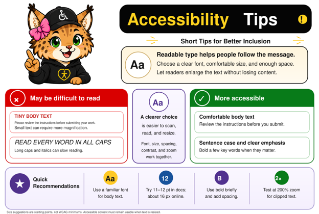
To improve readability, choose a clear font, a comfortable text size, and enough spacing. Check that readers can enlarge the text without losing content.
May be difficult to read
Tiny body text can require more magnification. Long passages in all caps or italics can slow reading.
More accessible
Use a familiar font for body text. Write in sentence case and use bold for a few key words when they matter.
Quick recommendations
- Use a familiar font for body text.
- Try 11 or 12 point text in documents and about 16 pixel text online as starting points.
- Use bold briefly and add spacing.
- Test at 200% zoom to check for clipped or overlapping text.
These sizes are suggestions, not WCAG minimums. The goal is readable text that remains usable when enlarged.
Interested in learning more about digital accessibility or scheduling a consultation?
Contact Rosanna Miiller Salas at: rosanna.miillersalas@ucdenver.edu
Small changes can create more inclusive digital experiences for everyone.